


Character Design.
- Dan Evans

- Oct 21, 2022
- 2 min read
Updated: May 12, 2023
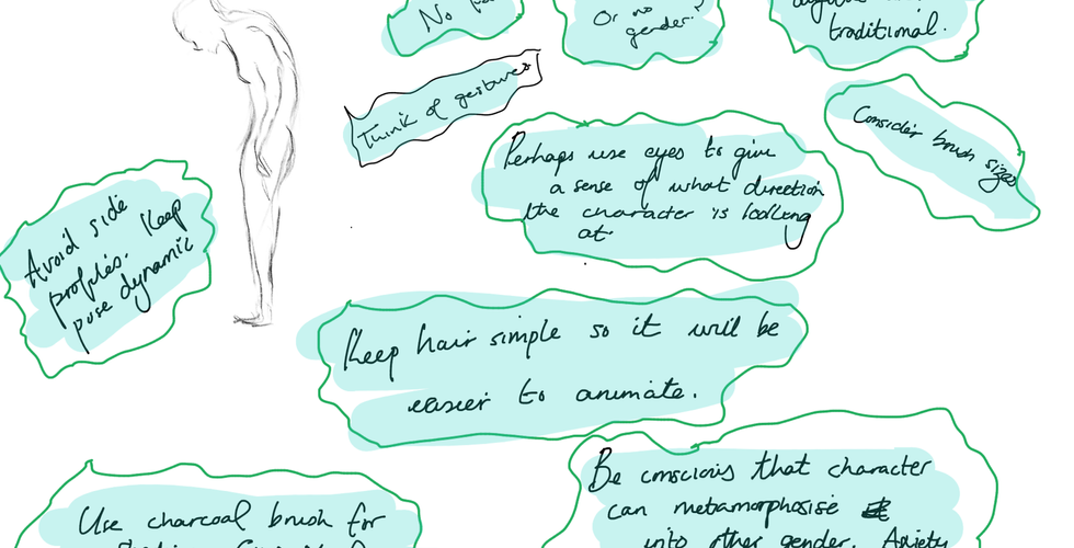
With regards to character design I first envisioned in the brainstorm process the two characters to have a simplistic form as I felt it was important not to put any physical characteristics such as hair because from a metaphorical perspective our outward appearance is a visual mask to conceal our internal thoughts and I wanted that to be conveyed within the project. With character design I tend to use my initial idea as the foundation for a final design and while I do explore, I try not to stray too far from it as it was that which sparked my passion in the first instance.
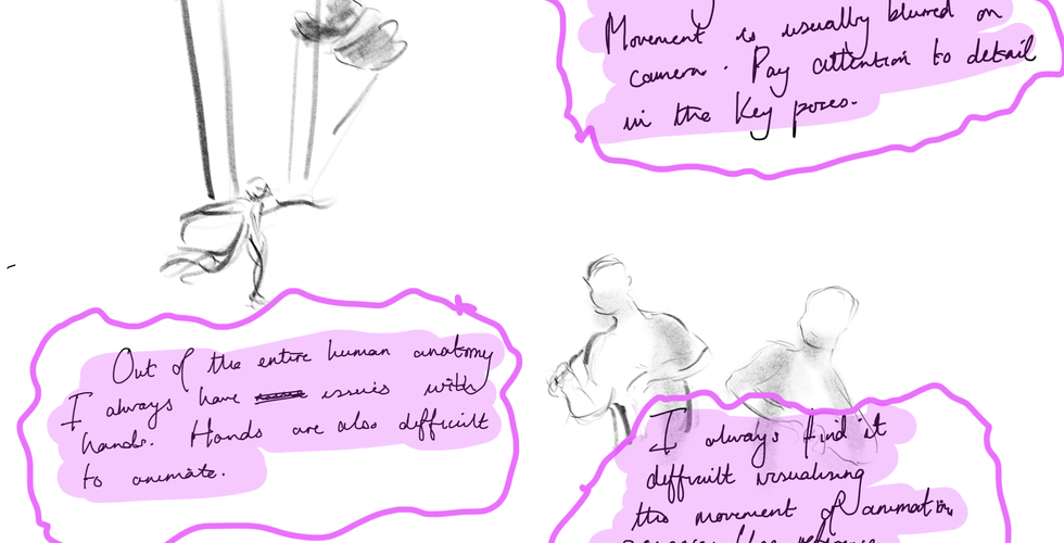
As previously stated one of my main inspirations is gesture/ figure drawing which can be seen within the design. I like the looseness of the pencil and wanted to solely focus on how the mark of the brush can amplify the simplistic approach I decided to use on character designs.
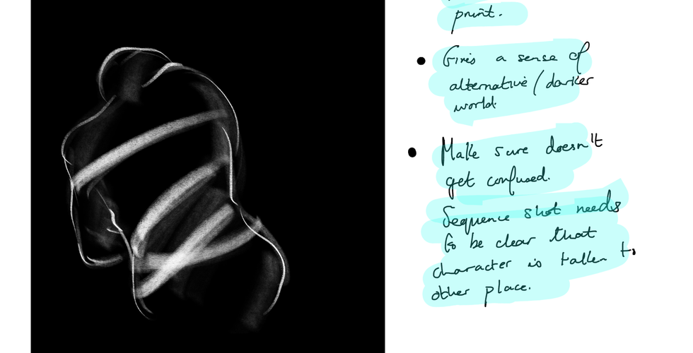
As Shadow is the inner demon of Light, it made sense to me that both characters are identical in their physical appearance with the exception of their colour to differentiate the two. Shadow is darker in colour compared to Light, as a darker tone is associated with negative connotations or at least that was my intention.
I initially thought not to give the characters any facial features as I liked the mystery over what the character may be thinking or even more intriguing, for an audience to come to their own conclusions, but the more I drew the characters the more I felt it was important to have some form of facial feature. I tried experimenting with various eyes sizes but each design was unsuccessful. One way I deal with situations in which I am unable to resolve is to leave it for some time and then return to it with a fresh perspective. Just by the off chance I began to draw smaller eyes as they would clarify that the character did indeed have them and there would also be a subtlety to them and in doing so I found an eye shape by which I was satisfied with.
What I found increasingly frustrating was not being able to find a brush which I could use to shade the characters. Without shading, the characters looked too flat and to a certain extent, dull. I tried shading the characters using a scribbly look but unfortunately it did not feel appropriate to use. I remembered that within my brush set I had charcoal brushes with various settings such as 2B, 4B etc which I believed could be compatible. I experimented with each charcoal brush until I found one which complimented my artwork (2B).
This process allowed me to reflect on how I would be able to convey an emotion or thought through gestures and body language, both exaggerated and subtle whilst adhering to the style I had chosen from a visual perspective. I was pleased with how I was able to explore and improve the overall look of the characters without straying too far from my original concept.
Developing the characters:


Process of developing characters:
Comments